.png?height=120&name=SB_Logo_Green-Charcoal-300dpi%20(1).png)
Editing CVE content cards in the platform
Refer to our main editing content card page for more information.
Content Relationships 🤝
Before you start editing your content cards, it's important to understand the relationship between the different parts that will make up what students see.
Students will scroll through a content card. A card is made up of multiple content blocks (ex. A section of the Campus Visit Experience content card that outlines the ways to take a tour.) Content blocks are made up of components. For example, an image or a button.
Navigating to content cards and what makes up a content card
How to edit your content card
Watch the video walkthrough below on how to edit your content card.
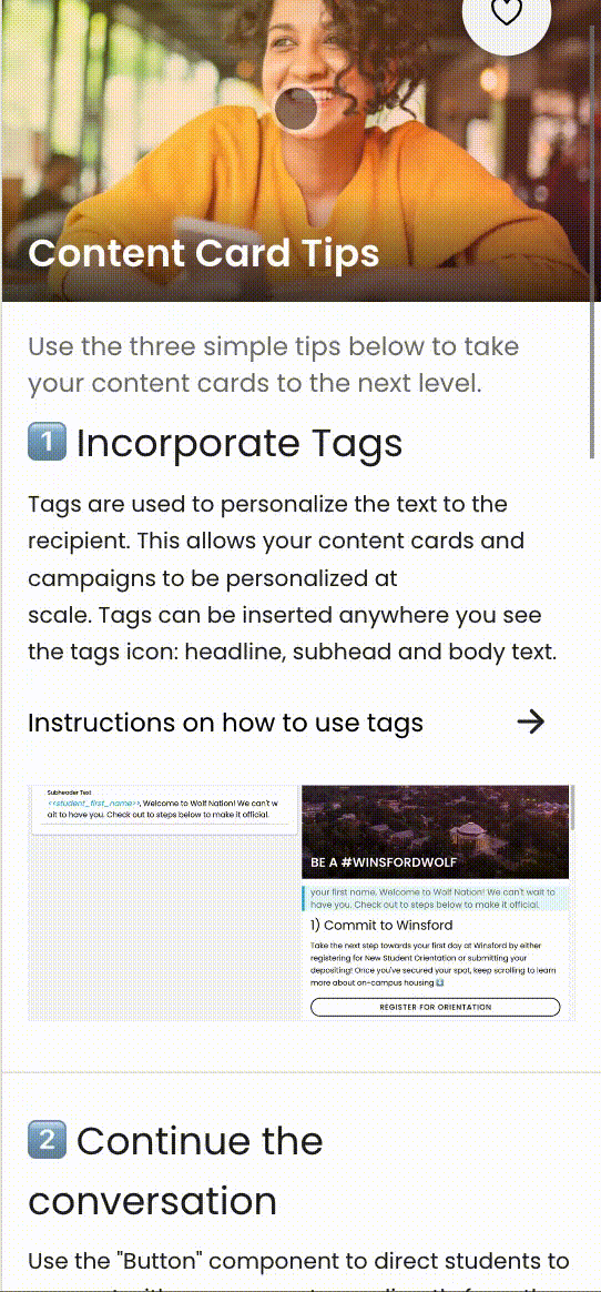
🌟 Image Guidelines 🌟
- Upload to our application as JPEG
- Max width should be 1080px (keep your aspect ratio locked if resizing)
- File size should be kept as small as possible
- “Front” image guidelines: Square JPEG, 600x600 if possible
For more information, visit our Content Card Image Guidelines article.
How to Edit Your Content Card Map
For your second templated content card providing students with on-campus arrival information, you have the ability to add in a map.
Please see below for instruction on how to edit the template to input your own map.
Details Section

When you click into a template, you’ll first see the “Details” section
-
Under “Card name,” name your content card. This won’t be student-facing, but will help your team stay organized. This will also be the name that displays in the Activity section.
-
We recommend including the name of the audience or purpose of the card, to help distinguish your content cards.
- After the edits are made in the “Details” section, go to the “Front” of the card.
Front Section

- Under “Content,” you’ll be able to select the formatting for the front of the content card. A preview of those options is on the right-hand side.
The front of the card should have a brief explanation of what the back has on it to drive the students to click on it. Example: "Welcome to Winsford! Sign Up for Your Tour"
- We recommend uploading an image for the front of the card. When you select “upload image,” you’ll be able to choose an image from your computer. Keep in mind that the image on the front of the card will also appear at the top of the back of the content card.
- If you would like there to be a color overlay, name the color in the “Color” section. You can use a hex code or color names. Then, use the sliding bar until the color overlay is to your liking.
- In the “Text” section, you’ll be able to customize the Lead In, Headline, and Subhead components on the front of the card. The Headline will also appear on the top of the back of the card. You can also customize if the text should be light or dark.
- After you've edited the "Front" navigate to the "Destination" section of the card
Destination Section
You can think of “Destination” as the back of the card and where you'll do most of your editing. This is the content your students will see once they tap the front of the card in the stream of content, or where they will be directed to from an outbound campaign.
- If you’re using a template, you’ll see a variety of components on the left hand side, and the preview on the right.
- To edit a component: Click into the component, and make edits as necessary.
- To move a component: Click the “hamburger menu” on the component and drag and drop into the desired place.
- To add a new component: Click the black plus button and select your component from the menu. Your new component will appear at the bottom.
- If you’d like to add a new component in the middle of existing content, click on the 3 vertical dots on a component and select “Insert,” and select your component from the menu. You can also swipe right on the component and then click on the green plus button, and select your component from the menu.
-
To delete a component: Click on the 3 vertical dots on a component and select “Remove.” You can also swipe left on the component and click the red trash can icon.
-
To duplicate a component: Click on the 3 vertical dots on a component and select “Duplicate.”
In each content card, you will see see a "Message Us" button. This allows visitors to message directly to the sender and start a two-way conversation. To edit this component, watch the video below ⬇️
Need help editing components based on your information? Utilize our Tips and Tricks content card for information about editing more complex components: