.png?height=120&name=SB_Logo_Green-Charcoal-300dpi%20(1).png)
How to edit content cards in the Full Measure Platform
🌟 Image Guidelines 🌟
Upload to our application as JPEG, Max width should be 1080px (keep your aspect ratio locked if resizing), File size should be kept as small as possible, “Front” image guidelines: Square JPEG, 600x600 if possible
Details Section
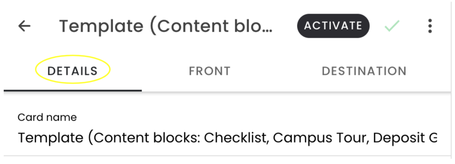
Details section
When you click into a template, you’ll first see the “Details” section
-
Under “Card name,” name your content card. This won’t be student-facing, but will help your team stay organized. This will also be the name that displays in the Activity section.
-
We recommend including the name of the audience or card, to help distinguish your content cards.
-
After the edits are made in the “Details” section, go to the “Front” of the card
Front Section
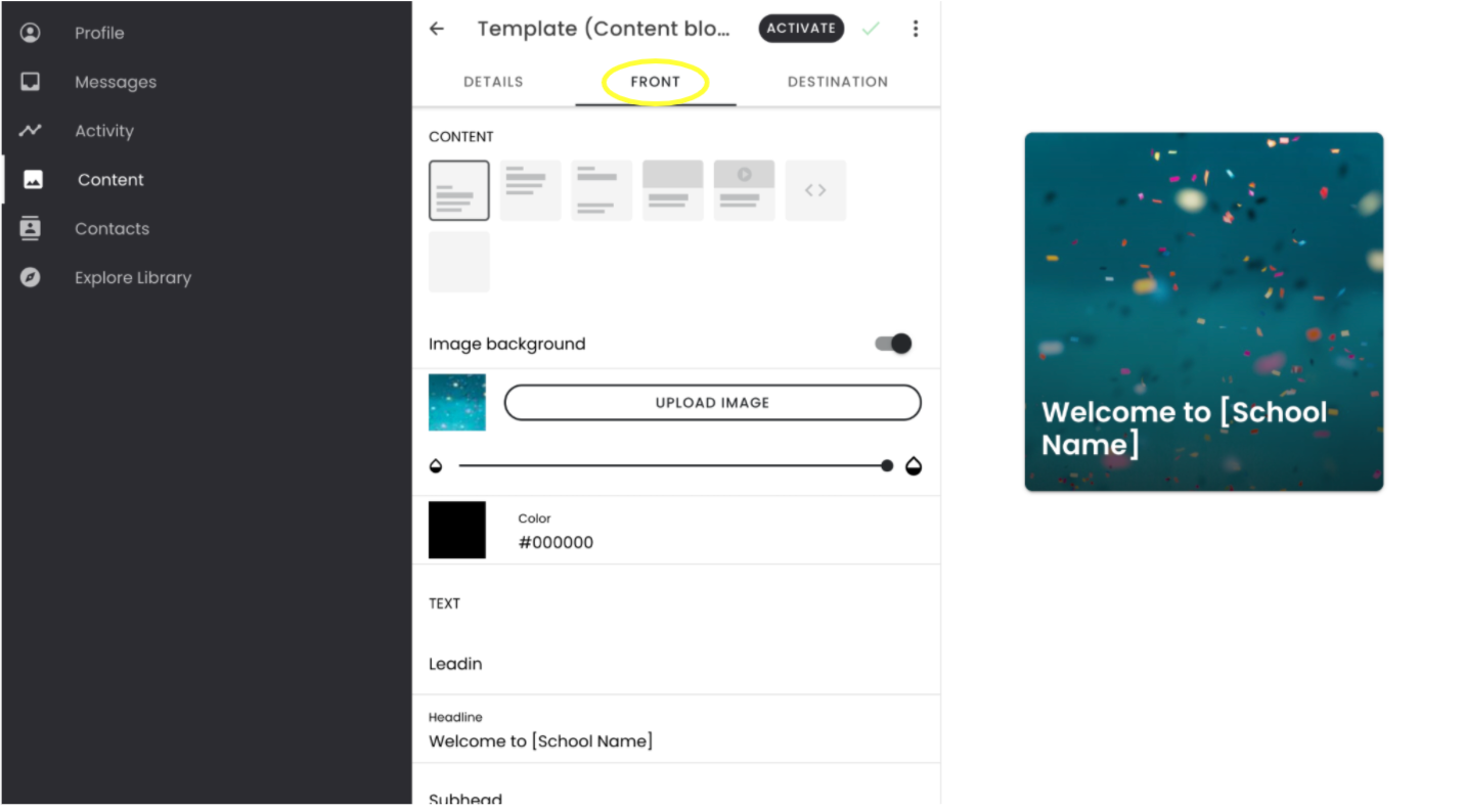
Front of the content card
-
Under “Content,” you’ll be able to select the formatting for the front of the content card. A preview of those options is on the right-hand side.
-
We recommend uploading an image for the front of the card. When you select “upload image,” you’ll be able to choose an image from your computer. Keep in mind that the image on the front of the card will also appear at the top of the back of the content card.
-
If you would like there to be a color overlay, name the color in the “Color” section. You can use a hex code or color names. Then, use the sliding bar until the color overlay is to your liking.
-
In the “Text” section, you’ll be able to customize the Lead In, Headline, and Subhead components on the front of the card. The Headline will also appear on the top of the back of the card. You can also customize if the text should be light or dark.
-
After you’ve edited the “Front”, go to the “Destination”.
Destination Section
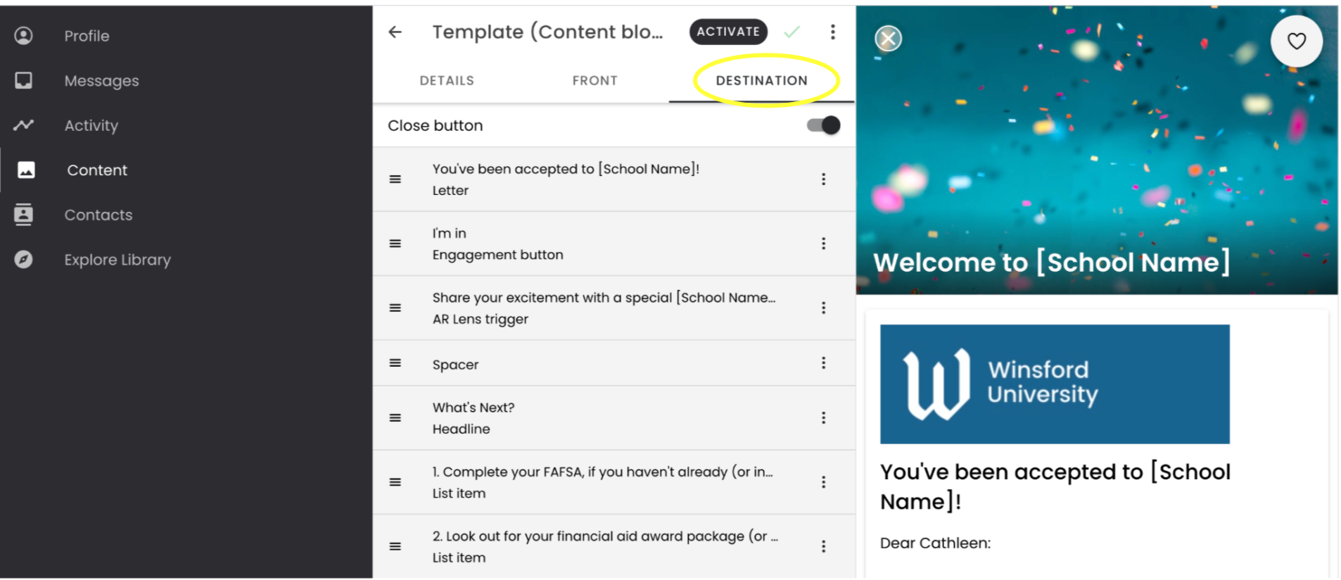
The destination is what your students will see
You can think of “Destination” as the back of the card. This is the content your students will see when they open the link from the SMS.
-
If you’re using a template, you’ll see a variety of components on the left hand side, and the preview on the right.
-
To edit a component: Click into the component, and make edits as necessary.
-
To move a component: Click the “hamburger menu” on the component and drag and drop into the desired place.
-
To add a new component:
-
Click the black plus button and select your component from the menu. Your new component will appear at the bottom.
-
If you’d like to add a new component in the middle of existing content, click on the 3 vertical dots on a component and select “Insert,” and select your component from the menu. You can also swipe right on the component and then click on the green plus button, and select your component from the menu.
-
-
To delete a component: Click on the 3 vertical dots on a component and select “Remove.” You can also swipe left on the component and click the red trash can icon.
-
-
- To duplicate a component: Click on the 3 vertical dots on a component and select “Duplicate.”
As a best practice, utilize tags in your content cards to personalize content at scale for your students. For information on how to do this, refer to our support article on tags.